Introduction
Over the years, I’ve built, leveraged, and revamped multiple design systems across diverse products. With each project, I learned something new, gained fresh perspectives, and even shifted my own assumptions.
Objective
This article is my way of capturing those lessons and recording where I stand today. Below, five key points I reflect on the importance of design systems and the principles that have guided my work.
Reflection 1
Design Systems as a Product: Documentation Is Key
A design system isn’t just a style guide—it’s a product in its own right. Its primary users are designers who rely on clear, actionable documentation to work efficiently. Documentation must be structured around your product team’s workflows and shared in a way everyone can easily reference; a guide only developers or only designers understand isn’t enough. By treating documentation as a first-class deliverable—complete with well-structured tokens, component guidelines, usage examples, and clear contextual notes—you reduce onboarding time, minimize design debt, and accelerate releases. A true design system delivers information in the exact format teams need to do their jobs without guesswork.
Reflection 2
Speaking a Common Language
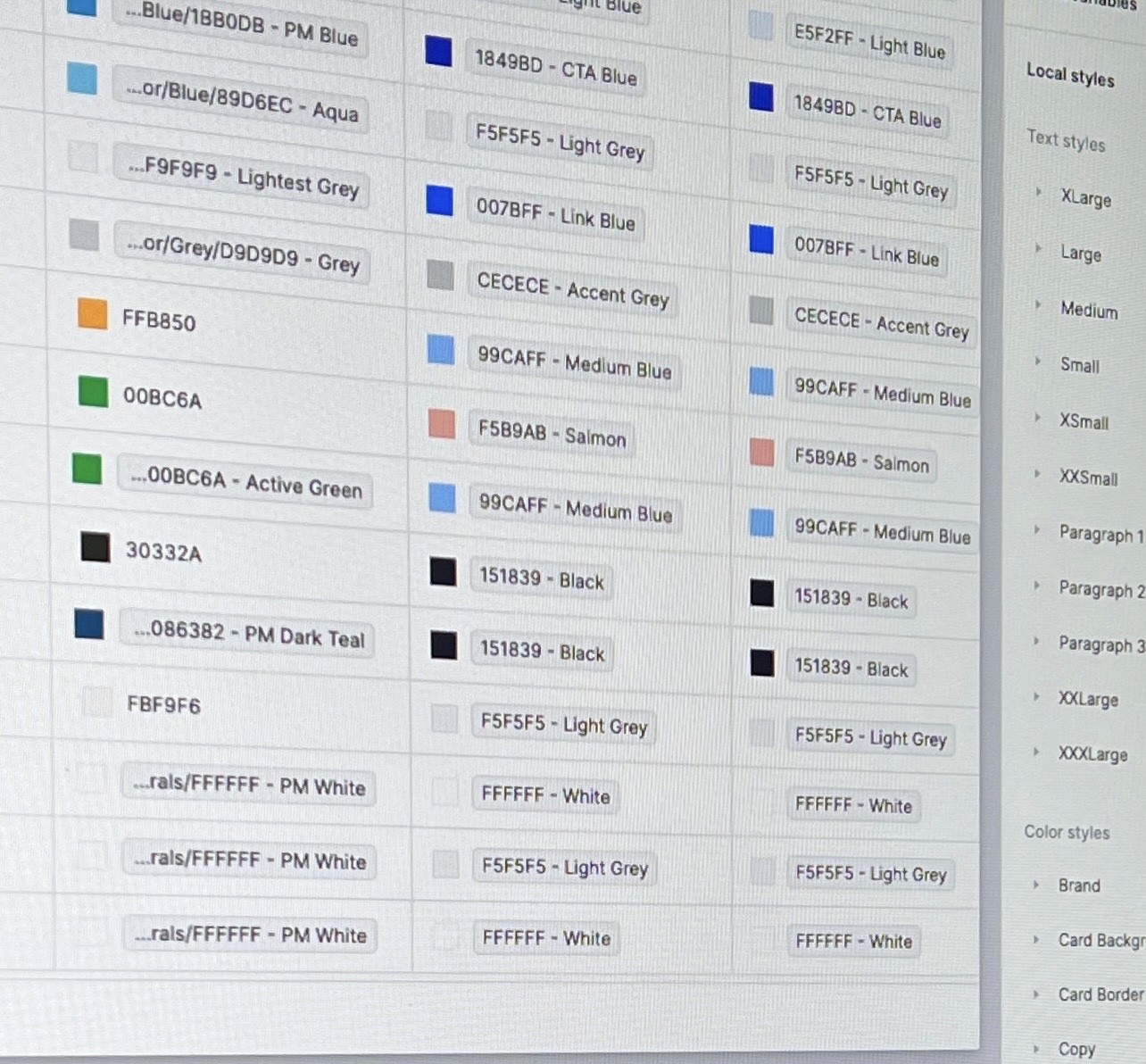
Consistent naming conventions transform a scattered component set into a shared vocabulary. When everyone—designers, developers, and product managers—uses terms like

collaboration becomes seamless. Clear, context-driven names eliminate guesswork, speed up handoffs, and ensure that every stakeholder interprets design intent the same way. By nailing down these names up front, you remove the endless “What do we call this?” questions from PMs and keep everyone focused on solving real problems.
Reflection 3
Rethinking “Scalable”
In a B2B platform serving many partners, I learned that scalability isn’t just about adding new features—it’s about delivering the simplest, most reusable designs across varied integrations. Though our core component designs remained unchanged, we focused on strategic CRO enhancements within existing flows. By swapping content rather than rebuilding patterns, we provided partner teams with ready-to-use modules that fit each unique journey, driving faster adoption and consistent experiences.
Reflection 4
Design system is a Living Document
It’s easy for a design system to drift when nobody owns its upkeep. In a CRO-driven team, every layout tweak, test variation, or accessibility fix should trigger an update to the source of truth—and a quick heads-up to everyone who uses it. Without clear ownership, you’ll hear QA teams pinging designers at the last minute to ask, “Which version is correct?” By assigning a dedicated steward, enforcing version tags, running regular review sessions, and broadcasting changes promptly, you keep the system—and the whole team—in sync.
Reflection 5
Do’s & Don’ts with Brand & Language Guidelines
Well-crafted Do’s and Don’ts cut down on endless slack threads, Figma comments and overtime meetings.
For example:
Do
use the secondary color only for annotations;
Don’t
apply it to primary CTAs.
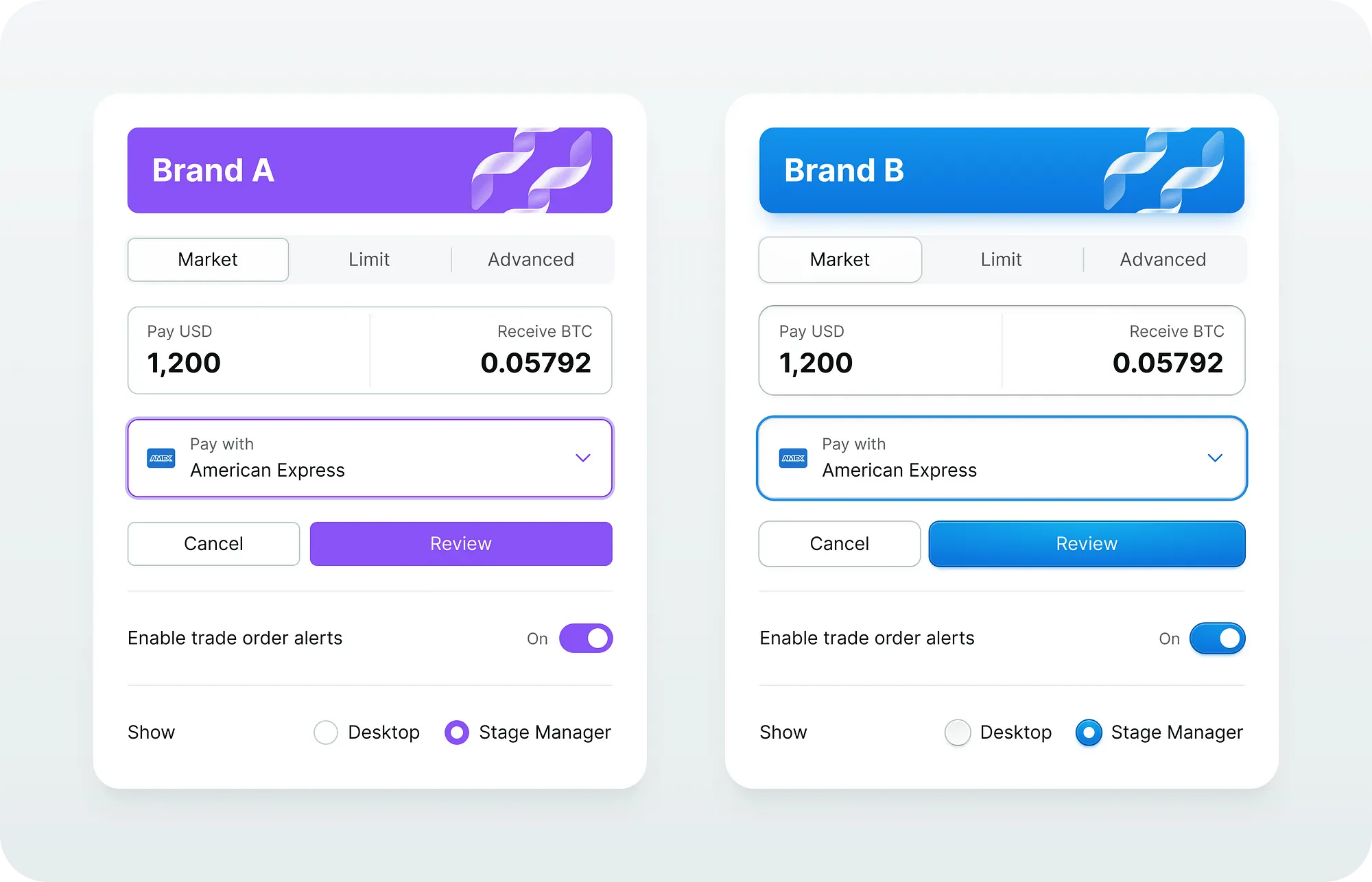
But a true design system guide must go deeper—especially for its main users, the designers. It needs to spell out where each component belongs, which color tokens to use, and the precise tone and style of copy. It’s common in early-stage or fast-changing environments to skip over these details, which then leads to guesswork and inconsistent outcomes. Making their definition and documentation a priority from the start enables designers to work confidently on their own, guarantees a uniform experience across every screen, and upholds brand integrity without adding extra overhead.